Best Spring Kitchen Color Ideas for a Light and Elevated Space
As the seasons shift, so does the way we experience our homes. Spring brings a natural sense of renewal: longer days, softer light, and more time spent gathering in the spaces we use most.
In the kitchen, this doesn’t always mean a full redesign. Often, it’s about how color, material, and light work together to create a space that feels brighter, more open, and aligned with how you live. Below are three spring color palettes we’re seeing resonate most, each grounded in timeless design, but refreshed for the season!
Soft Creams and Warm Woods
Spring often starts with light, which means the materials that reflect it are paramount.
Soft cream cabinetry paired with natural wood tones creates a kitchen that feels warm without being heavy, and bright without feeling stark. These palettes allow natural light to move through the space, highlighting texture and craftsmanship rather than competing with it.
This approach also creates flexibility. Seasonal elements such as fresh flowers, greenery, or even a shift in styling can stand out naturally against a more neutral foundation.
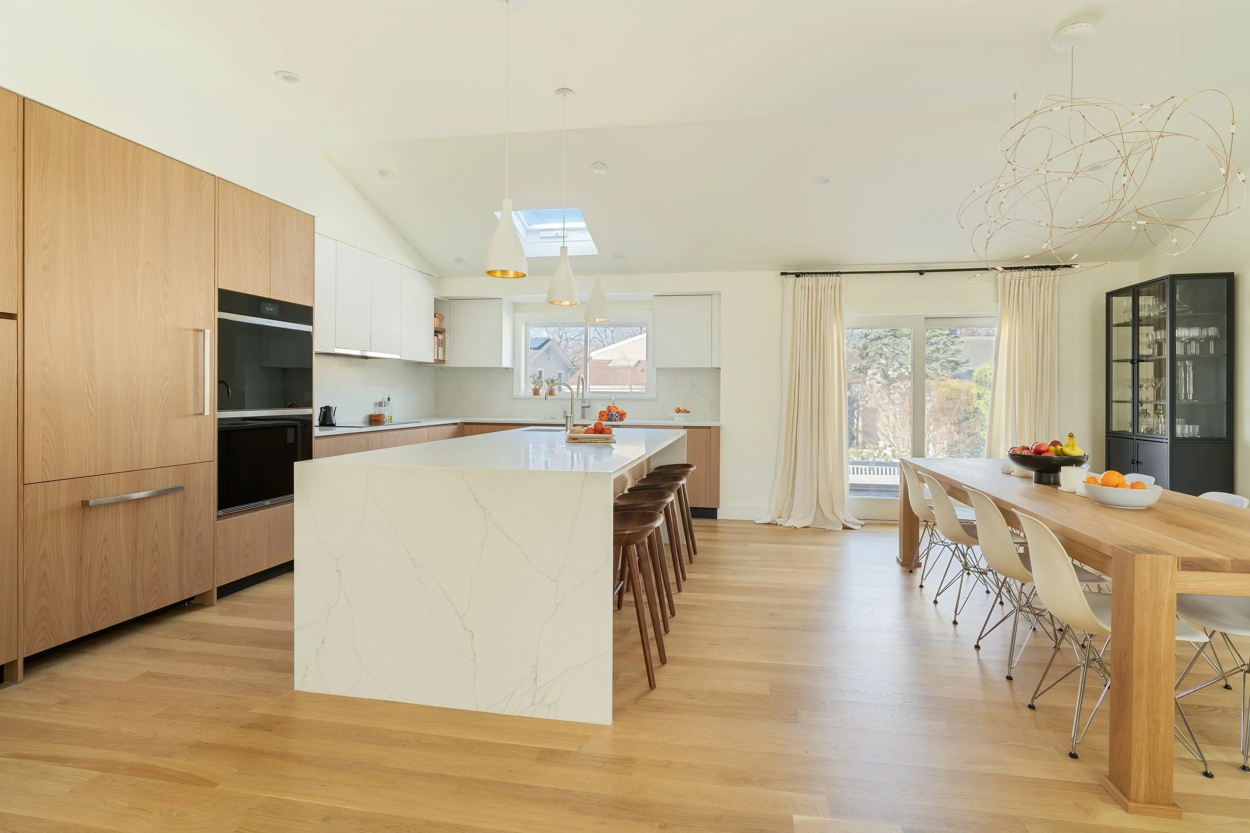
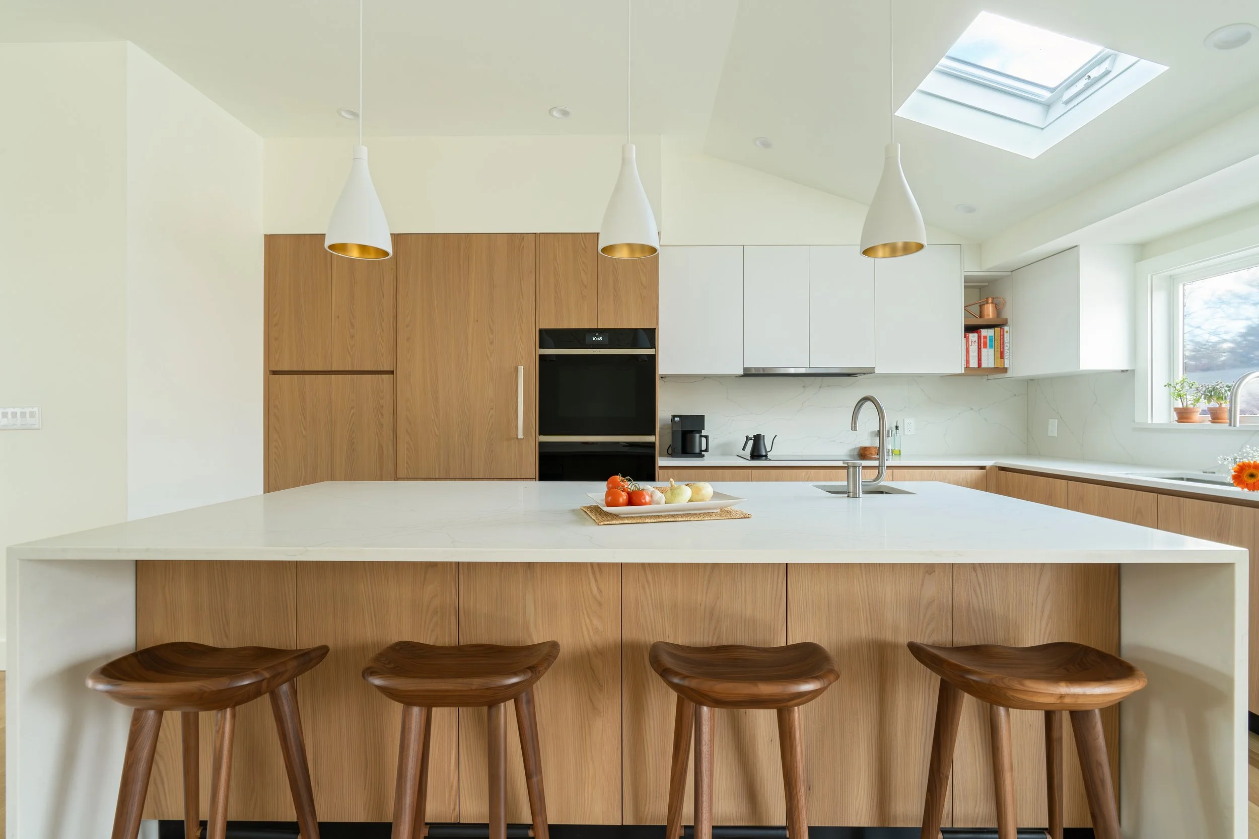
Where it works best: Full kitchens, especially in homes where natural light plays a central role.
Everything Marble
For those looking to introduce Spring charm in a subtle, intentional way, materials offer a natural entry point.
Neutral cabinetry brings a sense of calm and complements marble surfaces, keeping the overall palette elevated and refined. The balance between the two creates a kitchen that feels subtly seasonal, without leaning into trend.
Rather than overwhelming the space, this combo works by adding depth, just enough contrast to feel considered, but still cohesive.
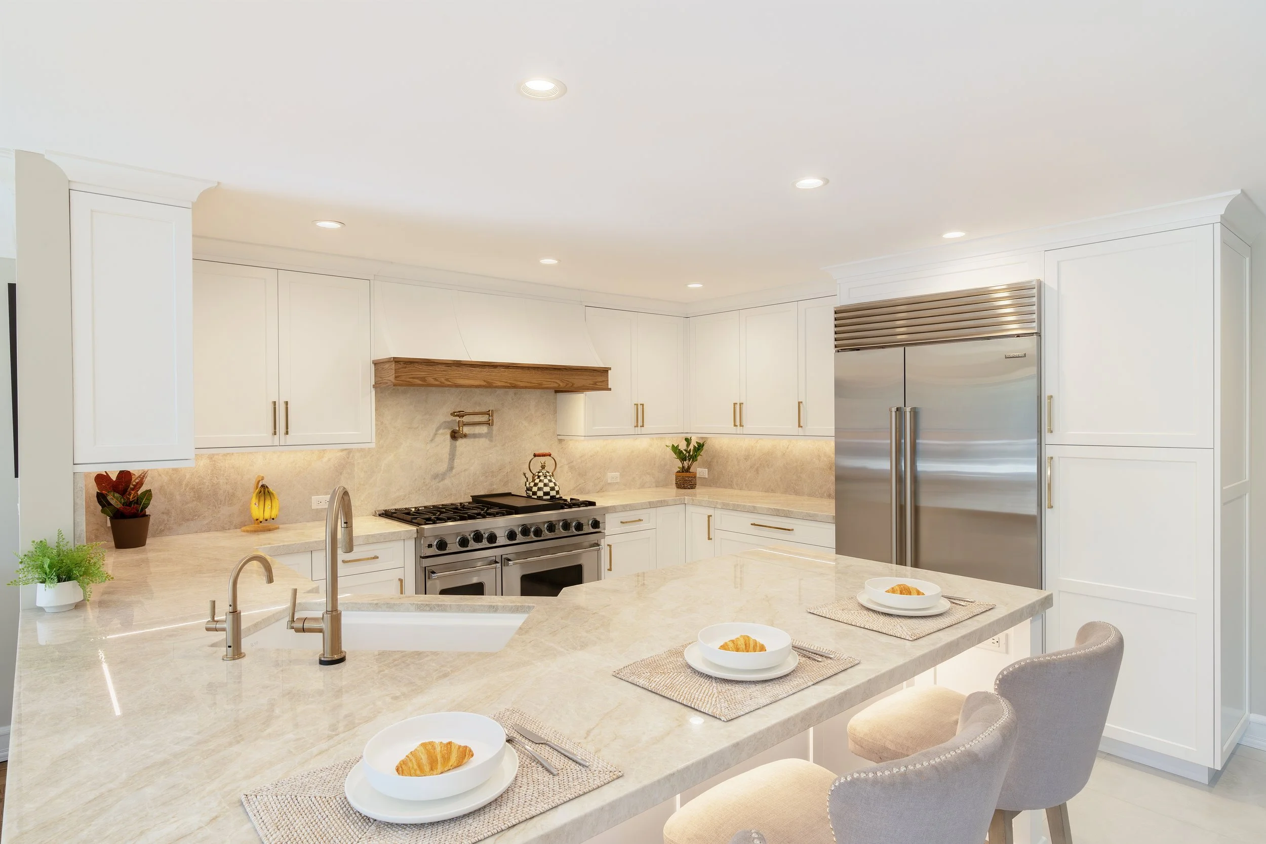
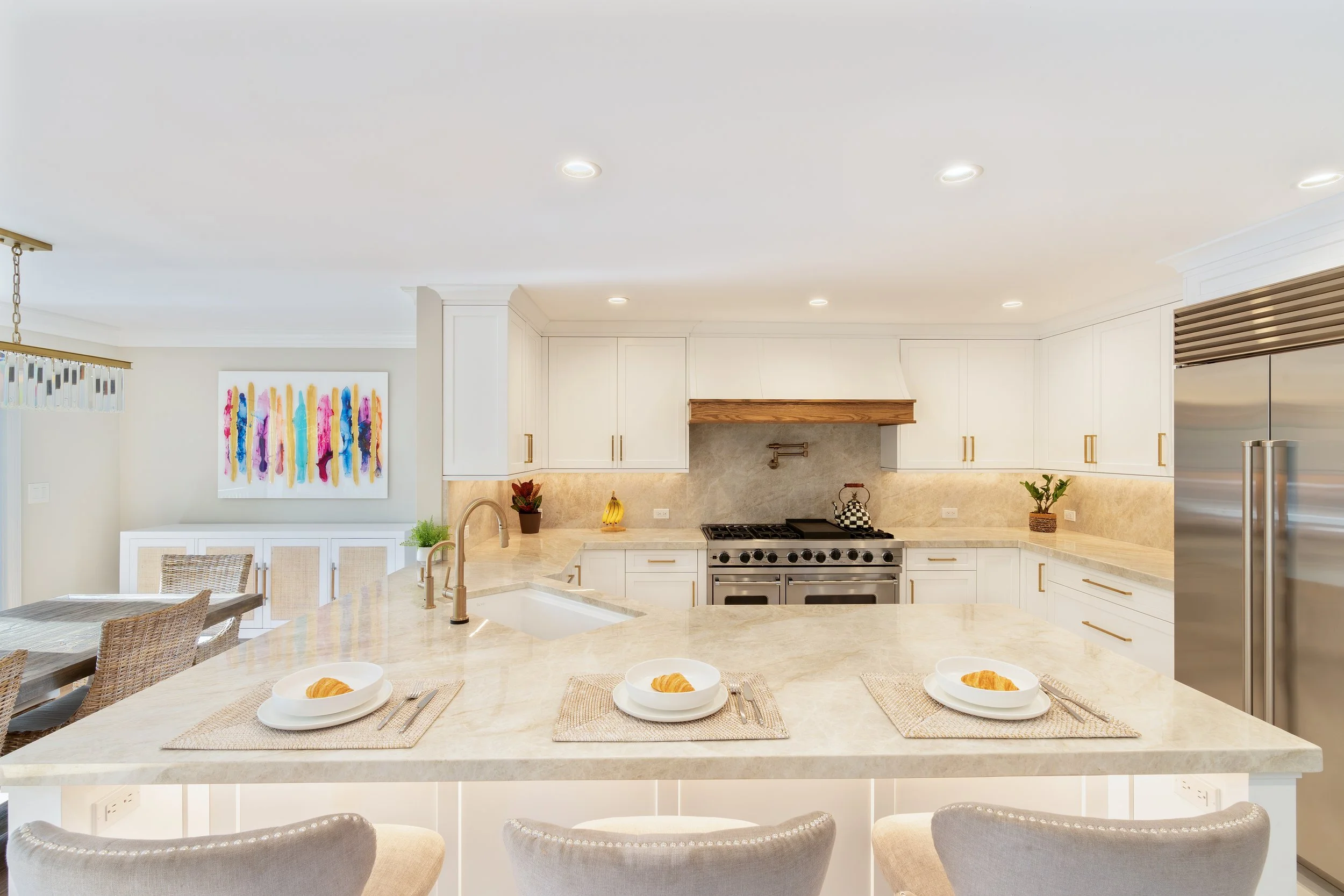
Where it works best: Islands, lower cabinetry, or full kitchens where a softer color story can complement surrounding materials.
Light Blue and Crisp White
For a bolder, but still timeless look, light blue paired with crisp is a classic combo. The white captures that open and airy feeling, reflecting light easily, expanding the visual footprint of the kitchen, and creating a sense of movement throughout the space.
This palette is especially effective in open-concept homes or areas where the kitchen connects directly to living and dining spaces. It keeps everything feeling cohesive while still introducing a fresh, seasonal shift.
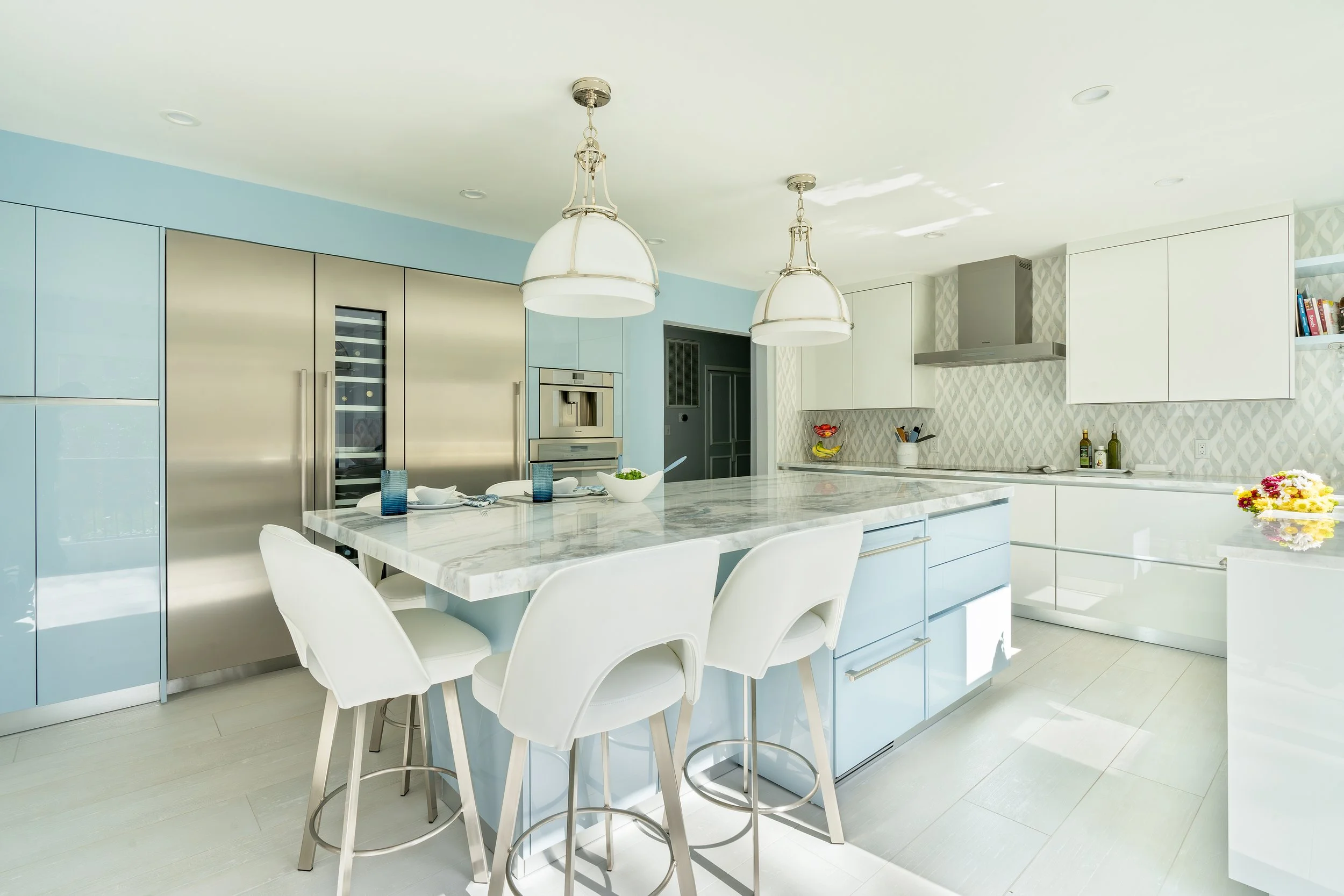
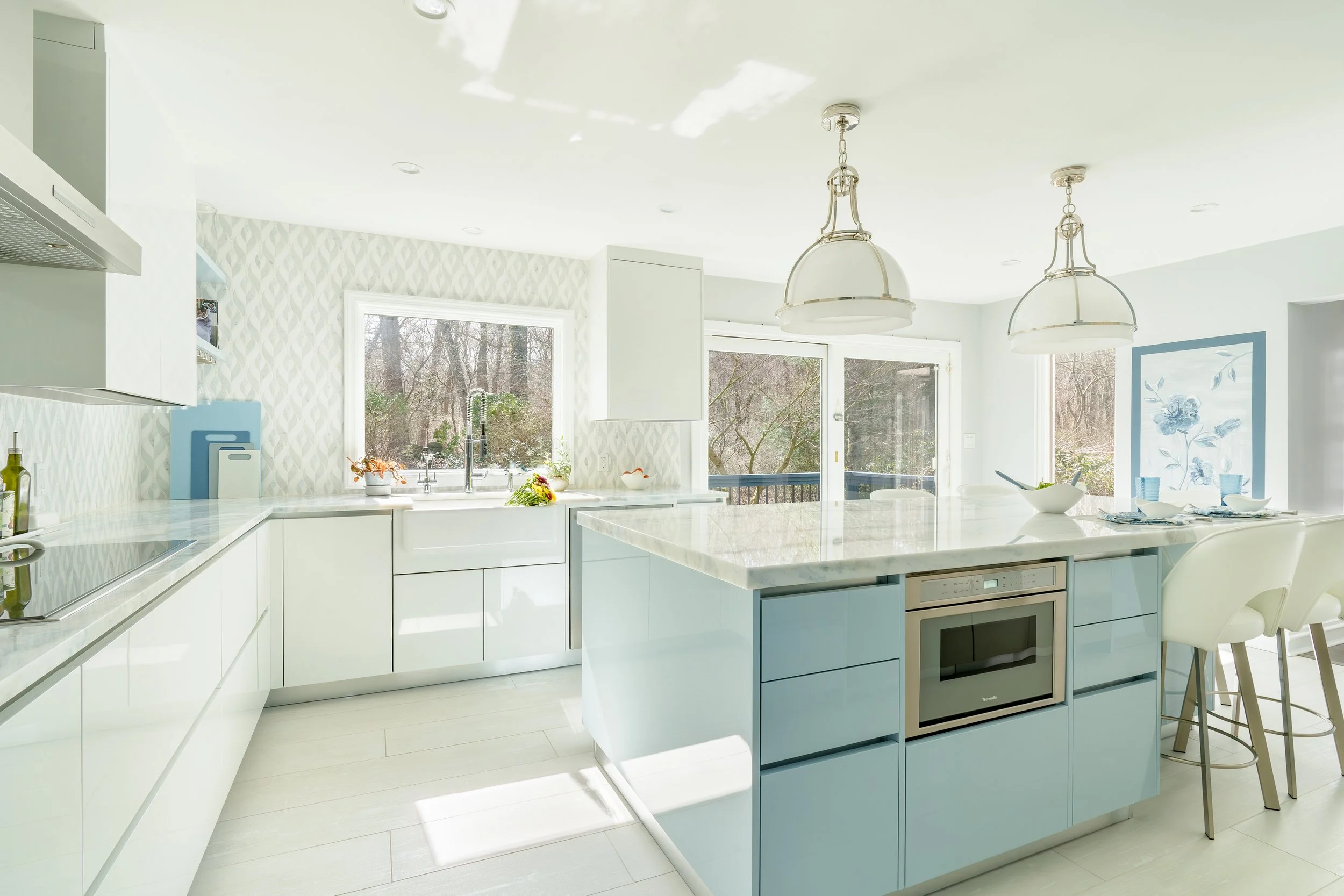
Where it works best: Open layouts, coastal-influenced homes, or kitchens designed around flow and visibility.
Designing for the Season Without Losing Timelessness
While spring invites change, the most successful kitchens aren’t designed around a single moment- they’re built to evolve.
Color is one of the most effective ways to reflect the season, but it works best when paired with materials, layout, and lighting that support how you live every day. In that way, spring design isn’t about starting over; it’s about refining what’s already there and allowing the space to feel its best.